Friday, February 1, 2013

LIGHT-DRAWING

Light-drawing and light-writing is getting a fair bit of attention lately. Take these two commercials (below) for Sprint (also seen on Marc Schiller's blog). Quite creative don't you think?
Light drawing by Lichtfaktor

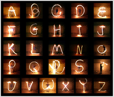
I've been seeing more and more light-drawing over the past month or so, and you can see some excellent photographs by scrolling down on Lichtfaktor's MySpace page.

Lichtfaktor gives the following tips on how to draw with light using your camera:.

To get the best results you need a tripod.
The exposure should be around 10-30 sec. or longer if needed.
Stay in front of the camera and do your writing.
Set the camera to about iso100, and close your aperture as much as possible. This prevents over-exposure. If there is still too much light you might have to use a nd-filter.


Aaron at milienzo recently published another interesting article drawing attention to Lichtfaktor's Flickr set.

If you're liking what you see, there's a cool urban light-writing hip hop video over at Wooster Collective. For drum and bass fans I'd recommend giving this light writing video a few minutes of your time.

Oh, and have you seen the Drag and Draw project from Philips? Now you can actually encourage your kids to draw on walls! I'm liking the innovation.

alphabet in light writing


alphabet light writing

The alphabet in light writing, found on Nir Tober's Flickr page. If light writing is your thing, check out this previous post of mine, with some light writing YouTube videos.

alphabet human


CATCH ME IF YOU CAN

Catch Me If You Can title sequence

The title sequence for Catch Me If You Can, in particular, is one of my favourites, and here are a few others worthy of a mention.


WOODCUT

This is a bit of news from earlier in the year, but it's still brilliant to see recent design graduate Melissa Preston flying the flag for Napier (my old university) by winning a D & AD pencil. Melissa's packaging design for WLTM Whiskies is below, intended to connect with the female whisky drinker. She made a small mistake by spelling whisky wrong, adding the 'e' that's only associated with Irish and American brands, but great packaging idea all the same.

WLTM Whiskies

What makes Subway the top-ranked brand in Siegel + Gale's 2012 brand simplicity index?
Why do we behave so oddly in lifts? On the BBC website, via swissmiss.

"At one point I was wondering if this was going to become my tomb - if they were going to open the doors and there's my corpse.".

Artist Vincent Kohler shows the different pieces of wood that are cut from a log. Via Kottke.

Vincent Kohler wood cuts


It's been quite a while since I watched anything so beautifully 
produced as this short on Vimeo.

FROM THE READER#15


"I think the symbol we created in 1986 for BAA (British Airports) is the most visually satisfying. I still like it for its utter simplicity. The three unadorned triangles constitute a symbol that immediately evokes airport activities and aviation but is clearly not an airline brand. ".
- JOHN LLOYD.

A 3-minute documentary on the resurgence of cycling in Athens, directed and edited by Sam Rowland.

"# 5 Keep your exclamation points under control. You are allowed no more than two or three per 100,000 words of prose. ".

A number of Elmore Leonard's novels have been adapted as films, including Out of Sight in 1998, Get Shorty in 1995, and Rum Punch (as the 1997 film Jackie Brown).

If you could put any video game into a museum, would it be one of the 14 chosen by MoMA? I don't know them all, but Tetris and Another World would definitely make my list.

Lego New York Another World


THE WALLERY

"Basically, we make unframed art. The Wallery is a place where a unique selection of international and emerging artists think outside the frame. We design art wallpaper murals and vinyls that make the frame obsolete. ".

The Wallery The Wallery The Wallery The Wallery The Wallery The Wallery

PACKAGING


GF Smith paper samples   GF Smith paper samples

GF Smith paper samples   GF Smith paper samples

"The design of our latest selector reflects the different ways in which people select our papers. In some instances, colour is the primary concern, before material type, texture or weight. However, these priorities are often reversed, making style the key point of reference. So now we give you three modes of paper selection: Select Colour, Select Black + White or Select Range. ".

GF Smith paper samplesGF Smith paper samples

TYPOGRAPHY


"This is a self-initiated typographic experiment that explores the relationships between upper-case and lower-case letters, and also records the transformation between them.

Handmade type


"In this experiment I drew shapes with ink on one or both of my hands, manipulating my gestures into the corresponding shape to signify an upper-case letter. Then, using the same shape on my hands, I manipulated my gesture or changed the perspective through which the shape is viewed in order to transform the upper-case letter to a lower-case of the same letter. Removing or redrawing the darkened shape on my hands was not allowed in the experiment. The only way to make the model transform from an upper-case to a lower-case (or vice versa) was changing the gestures or the perspectives.

"I created 26 sets of these inked shapes and drew them on my hands. Each set is made to create both an upper-case and a lower-case letter, such as A and a. I also created some italics, handwritten letters, and some new typefaces with the same shapes. ".

Handmade type
Handmade type


Graphic design portfolio


"TalkTo makes it possible to text any local business - as easily as you text your friends - and ensures that you can get a text response. Ask questions, book appointments, give feedback and more. It's fast and easy. So quit wasting time on hold or hunting through a "contact us" page. Just send a quick message, get on with your day, and let the response come to you. ".


TalkTo brand identity                    TalkTo brand identity
 
TalkTo brand identityTalkTo brand identity

                
"You're pretty awesome to work with. Incredibly organized, easy to communicate with, responsive with next iterations, and beautiful work. ".